Bootstrap Header Creation Easy to use Guide For Beginner.
First, let us break down the entire process of creating a header (or navbar) in Bootstrap in more detail for beginners explaining each step making it easier to understand. Now, we will see the implementation of this from setting up Bootstrap in your project and creating customized header.
Step 1: Set Up Bootstrap
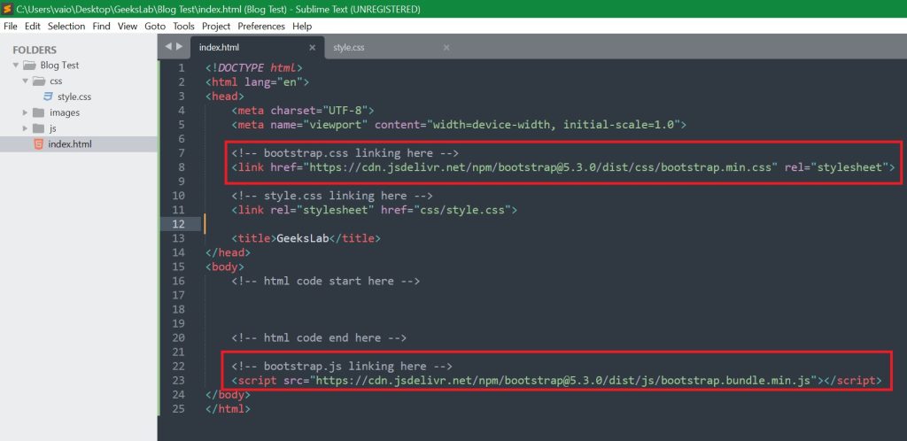
To use Bootstrap, the first thing you will need to get is the CSS and JavaScript files associated with it. Using bootstrap via CDN (Content Delivery Network) — The Easiest Way to link bootstrap in your HTML file. We will see where to link bootstrap CDN links in html code in the next image of step 2.
Step 2: Structure of Your HTML
With Bootstrap ready for use, it’s time to lay out a simple HTML structure for the page. This is your starting point. The next image presents the basic structure of html code and where to place bootstrap CDN links.

You can copy the code from here.
 <!DOCTYPE html>
<html lang="en">
<head>
	<meta charset="UTF-8">
	<meta name="viewport" content="width=device-width, initial-scale=1.0">

	<!-- bootstrap.css linking here -->
	<link href="https://cdn.jsdelivr.net/npm/bootstrap@5.3.0/dist/css/bootstrap.min.css" rel="stylesheet">

	<title>GeeksLab</title>
</head>
<body>
	<!-- html code start here -->


	<!-- html code end here -->

	<!-- bootstrap.js linking here -->
	<script src="https://cdn.jsdelivr.net/npm/bootstrap@5.3.0/dist/js/bootstrap.bundle.min.js"></script>
</body>
</html>
Next we will add Bootstrap navbar for header.
Step 3 — Header/Navbar
A navbar in Bootstrap is an instance of a navigation bar and is usually located at the top of your web page. Now to make sense of it, step by step here is how you can add and customize it.
You can copy the code from here.
<!-- html code start here -->
	<nav class="navbar navbar-expand-lg navbar-light bg-light">
	  <div class="container">
	    <a class="navbar-brand" href="index.html"><img src="images/logo.jpg" alt="" class="w-25"></a>
	    <button class="navbar-toggler" type="button" data-bs-toggle="collapse" data-bs-target="#navbarNav" aria-controls="navbarNav" aria-expanded="false" aria-label="Toggle navigation">
	      <span class="navbar-toggler-icon"></span>
	    </button>
	    <div class="collapse navbar-collapse" id="navbarNav">
	      <ul class="navbar-nav">
	        <li class="nav-item">
	          <a class="nav-link active" aria-current="page" href="index.html">Home</a>
	        </li>
	        <li class="nav-item">
	          <a class="nav-link" href="#">About</a>
	        </li>
	        <li class="nav-item">
	          <a class="nav-link" href="#">Services</a>
	        </li>
	        <li class="nav-item">
	          <a class="nav-link" href="#">Contact</a>
	        </li>
	      </ul>
	    </div>
	  </div>
	</nav>
<!-- html code end here -->
If you run this code, you will see an interface like the image below. Before that, you need to change the name or logo in the navbar brand or logo. You need to keep your own logo in images folder.
Explanation of the Code: in our code-
- <nav class=”navbar navbar-expand-lg navbar-light bg-light”>:
- navbar: This is the base class for creating a navbar.
- navbar-expand-lg: This makes the navbar responsive. On smaller screens, the navbar will collapse and display a toggle button.
- navbar-light: This class makes the text and links dark, ideal for use on light backgrounds.
- bg-light: This gives the navbar a light background color.
2. container-fluid: This makes the navbar stretch across the full width of the screen.
Branding: This presents the brand name or logo of the website.
Toggle Button: In a responsive web page, when we open the web page in the browser, we will see a bar icon instead of a menu. If we click on it, it will expand and we will see our nav items (Home, About, Service etc..) this called a toggle button.
Step 4: Customize the Header
Change the Navbar Background Color:
Bootstrap has many pre-built colors classes that you can apply for navbar.
For example:
- bg-dark for a dark background
- bg-light for a white background
- bg-primary for a blue background
You can set any color or image in the navbar background, we will learn in detail in another post.
Add a Search Box in navbar:
You can also add a search box/ form in your navbar. For this you need to add the code shown in the image below.
You will learn – how to customize header / navbar with CSS code in another post.
