Bootstrap is an open-source front-end web-framework for designing responsive and mobile-first websites. GitHub was built by Twitter engineers Mark Otto and Jacob Thornton released in 2011. One of the strengths in Bootstrap is its many collections of CSS and JS components to help us build a modern visually pleasing website without writing complex custom code.
Bootstrap is a front end framework — CSS with some JavaScript components.
Key Features of Bootstrap:
- Grid System: This is used to layout the structure of the web pages, it uses a responsive grid system, where each row consists of twelve columns. Grid that adapts to the size of the screen(desktop, tablet, mobile) automatically.
- Responsive Design: The major goal of Bootstrap is Responsive web design wherein the design of sites constructed utilizing Bootstrap get changed naturally with the adjustments to screen size and guarantees that the clients see a majorly fancy data each time.
- Pre-built Components:Bootstrap comes with a lot of built-in reusable components like navigation bars, buttons, modals, forms, carousels etc. You can easily customize & style these components.
- CSS & JavaScript: It contains CSS styles, as well as JavaScript components (jQuery). Most of the time, extra interactivity (or custom animation) is added on top via JavaScript plugins: modal, tooltip, dropdown, popover etc.
- Powerful Customization: With Sass (Syntactically Awesome Stylesheets) variables, developers can customize Bootstrap components without completely re-writing its source files; this allows developers to adapt design or branding such as colors, padding and fonts according to their need.
- Cross-browser Compatible: Bootstrap is made to work well with almost all modern web browsers like Chrome, Firefox, Safari, and Edge etc. which means our website can look better in most environments as well.
- Utility Classes: Style properties (e.g., margins, paddings, display as) are already provided by bootstrap utility classes. These classes will allow you to quickly achieve common styles without writing custom CSS.
JavaScript Components:
Bootstrap also has JavaScript (JS) components(such as modals, dropdowns, tooltips, carousels …) to add interactivity to the UI. Bootstrap 5 does not use jQuery unlike previous versions, in its place the vanilla JavaScript.
Bootstrap is known for its CSS properties, but it also uses JavaScript to make it more interactive with dynamic components for better user experience. You can, however, only use the CSS part of Bootstrap without any included JavaScript components.
How to use Bootstrap:
You can use Bootstrap in two ways. One is CDN linking and another is downloading and placing bootstrap files to the project folder.
Include Bootstrap using CDN link:
To include a CDN Link package in your project, you need to follow these steps:
- Visit the official Bootstrap website.
- Just scroll down a little and you will be displayed an interface as in the image below.
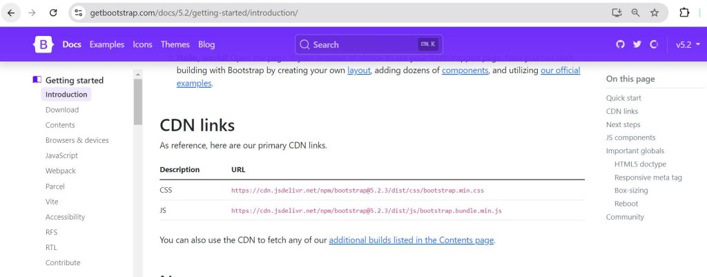
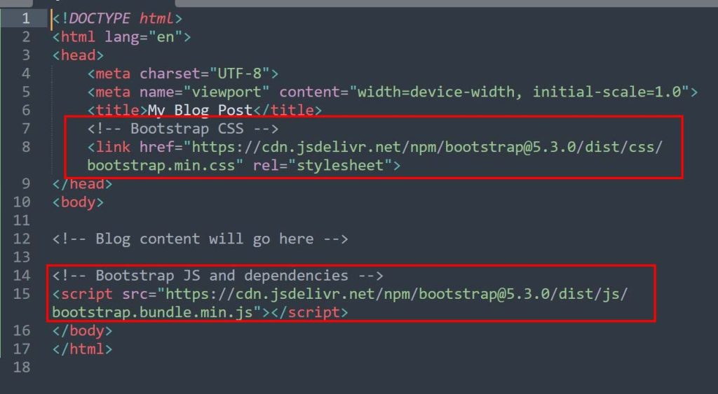
3. Copy the css Link and paste it in the css in the head tag.
4. Copy the js Link and paste it in the bottom of the body tag as shown in the image below
Include Bootstrap Downloaded files: It means to add a bootstrap package that you have downloaded in your project, follow these steps:
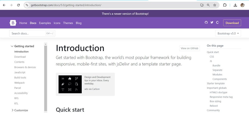
Step 1: Download Bootstrap Files: Download Bootstrap from Bootstrap website.
- Go to the Download section.
- Download bootstrap files following this link: Download bootstrap
- The downloaded zip file you will extract. Inside here, you have —
- bootstrap.min css – The minified version of Bootstrap’s CSS in your css folder.
- bootstrap.min js: The minified version of Bootstrap’s JavaScript.
Step 2: Include Bootstrap Files in your Project
After Bootstrap downloaded and extracted, link the Bootstrap CSS file to your HTML document. How to add Bootstrap in your HTML page.
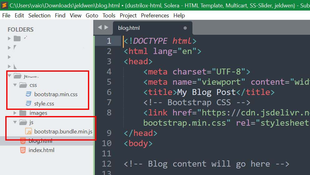
Folder structure:
- Create a directory for your project.
- In this folder you can create subfolders for CSS and JS. Simply dump the Bootstrap files in those directories.
Core Features of Bootstrap
1.Responsive Grid System:
- A grid system is what makes Bootstrap stand out the most from its competition. Developers can build adaptive layouts with the ability to adjust across devices of different screen sizes from desktops, tablets and mobile phones. Responsive system for 12 columns.
- Breakpoints: Bootstrap has a 12-column grid which scales from Auto to Explicit based on the following breakpoints. The primary breakpoints are:
- Extra small devices ( xs < 576px )
- sm (small devices, ≥576px)
- md (medium devices, ≥768px)
- lg (large devices, ≥992px)
- xl (extra-large, ≥1200px)
- Screen > xxl (extra-extra-large devices, ≥1400px)
- Pre-designed Components: Bootstrap provides a variety of reusable components that will allow you to easily speed up web development. They are also dropped in to be visually appealing and work the same way on every browser, on any device. Example of few Bootstrap components that are the most commonly used:
- Buttons: Various buttons in different sizes, colors and states (active, disabled).
- Forms: Fill a form with any bootstrap standardized class or color. Each form can have its personalized touch out of the standard blueprint. Allows spacing and aligning inputs for proper built forms online users to fulfill their date, credit card, even buy products on your website safely and correctly.
- Navbars: which are navigation headers that reuse the same markup for additional configuration.
- Modals: a modal is a dialog box or pop-up to be able to show content material comparable as an overlay, generally for user interplay that might not take them outside the current web page.
3. Responsive Utilities: Bootstrap utility classes are useful for quickly styling elements. These utilities provide different types of spacing, display properties, alignment, text and visibility control. Some examples include:
- Spacing: mt-4: Adds margin-top. mb-3: Adds margin-bottom.
- Visibility: d-none: Hides an element. d-block: Displays an element as a block. d-lg-none: Hides the element on large screens but keeps it visible on a smaller screen
4.Typography and Icons:
Bootstrap comes with pre-styled typographic elements making it easier to define headings, paragraphs, lists, and blockquotes. The framework uses modern fonts and provides classes to adjust the font size, color, weight, and alignment.
5. JavaScript Components:
Along with CSS Bootstrap also includes a set of JavaScript components adding interactive functionality to your site. These components help improve the user experience by offering dropdowns, collapsible content, carousels, tooltips, and many more.
Some of the JavaScript components include:
- Dropdowns: create customized dropdown menu with alignment and toggling behavior.
- Tooltips: display additional information on hover.
- Carousels: Create image or content sliders that automatically rotate or control manually
6. Customizable:
Bootstrap is highly customizable. Using Sass, developers can adjust the framework’s variables such as colors, fonts, grid behavior, among other styles. It allows for a customized design with original bootstrap structure.
Alternatively, developers can build custom bootstrap by adjusting the sass variables or use tools like Bootstrap Customize to download specific components adjusting the framework to your project needs.
Conclusion:
Bootstrap is continually changing, with its latest version, Bootstrap 5, offering improved customization, cleaner syntax, and removing the jQuery library dependency. Whether you are creating simple landing pages, admin dashboard, or a full-featured web app, Bootstrap offers an excellent foundation for development. Its responsive grid system, reusable components, and less effort to use make it the best choice for both beginners and experienced developers.


